Graphic Design – What’s The Best Colour For A Website?
The colour of your website can say a lot about your business, so how do you know if your colour choices are giving off the right impression?
Colour choice is critical to how people are going to perceive your brand. How those colours combine on your website is also just as important. If 93% of people look at the visual appearance of something before they buy, then naturally colour will play a big part in this.
Most people who set up a website hire a website or graphic designer to look after the branding and the choice of colours for the logo and the website.
Yet choosing the right colour to begin with should be part of a consultative process between the graphic designer and the business owner because once it’s associated with your brand, then it can be difficult to change things later on.
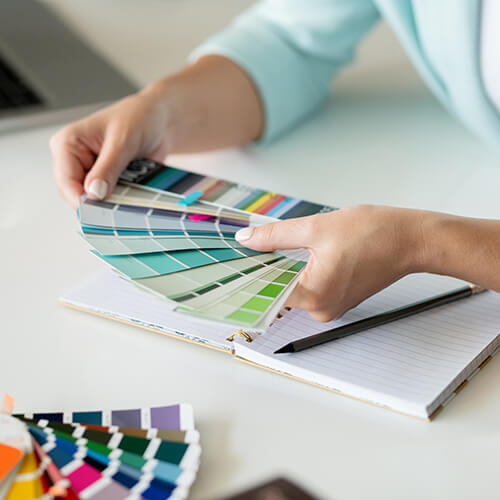
With this in mind its surprising how little time some business owners spend on choosing the colour of their website. Picking a favourite colour for a website may satisfy personal tastes but sometimes it isn’t the right one for the business.
My favourite colour has been red since as far back as I can remember. Apparently the favourite colour for most people is blue. Blue is fine if you’re Facebook or Linkedin. Blue is seen as cool and intelligent, which is why it’s the colour of choice for many corporate websites.
Colours are actually a major part of the emotions your website is triggering in your customers. It will also play its part in whether or not they buy your product or service.
It probably took a bit of time for Facebook and Linkedin to come up with a particular shade of blue for their logos and websites, just as it did for the creators of Twitter when they settled on light blue. Google keeps it simple with four colours on a plain white background.
The irony is that even though choosing blue did these billion dollar Internet businesses no harm, it can be seen as anything but friendly and 'social'. Blue isn’t the ideal choice if you want your business to be seen as exciting or warm like a small hotel or restaurant.
Red on the other hand could be a better choice to communicate a feeling of warmth and stimulation you would expect to find in your favourite restaurant. On the flipside red can come across as aggressive, and it certainly attracts attention. If you’re trying to sell products on your website then this is a good colour but you may be stuck when you want your sale items to stand out.
If you’re looking to play safe, white or green are a calmer alternatives. Green is often associated with nature and sustainability which made it popular a few years back when lots of business wanted to communicate how ‘green’ they were.
White is the ultimate safe choice if you want your website to look minimalistic. White looks good if you own a dental surgery or if you want to project a nice clean image for your website when there is a lot happening on the page.
Be careful with your use of white though because the disadvantage is it can look overly sterile and lack personality, which is not much good if you happen to be a creative business or an entertainer.
The key to using white well is to add elements of strong colour to the web page. Another benefit of using white is that text always looks better and it’s easier to read on a white background so it’s the best choice for blogs.
Some other colour choices you may consider are:
Grey – it can come across as dull, so use sparingly
Yellow – usually associated with fun and happiness. Combining with black can create a feeling of hostility
Orange – Orange goes in and out of fashion. Too much of it can look like you’re not taking things seriously
Violet – or purple can be overpowering and it can darken the mood when mixed with black
Pink – pink is always associated with femininity, which is fine if you’re a hairdressing salon and you want to create that impression
Brown – Another colour that triggers the feeling of warmth but again too much brown can be dull and come across as too serious.
Web designers in recent years have increasingly introduced flat design schemes which use retro or monotone colour schemes which display well on mobile phones and look good with simple visual designs.
This has brought a revolution in the use of colour which is changing the face of web design for the better. Even so, choosing a colour for your website and branding still takes time but it’s worth giving colour the attention it deserves.